Recharging the paper bill
Through strategic design thinking and a user-centered approach, I simplified 7 core components of the paper bill experience, improving clarity and comprehension for over 800,000 customers. The redesign set a new standard for utility communication, aligning business goals with real user needs.
Case study · 01
- Service period
- Jan – Apr 2022
- Client
- TECO (Tampa Electric & Peoples Gas), via IBM
- Role
- UX/UI Design, User research
- Methods
- Industry audit, 30 interviews, co-creation workshop
- Tools
- Adobe XD, Mural, Zoom, Google Forms, Excel, Slack
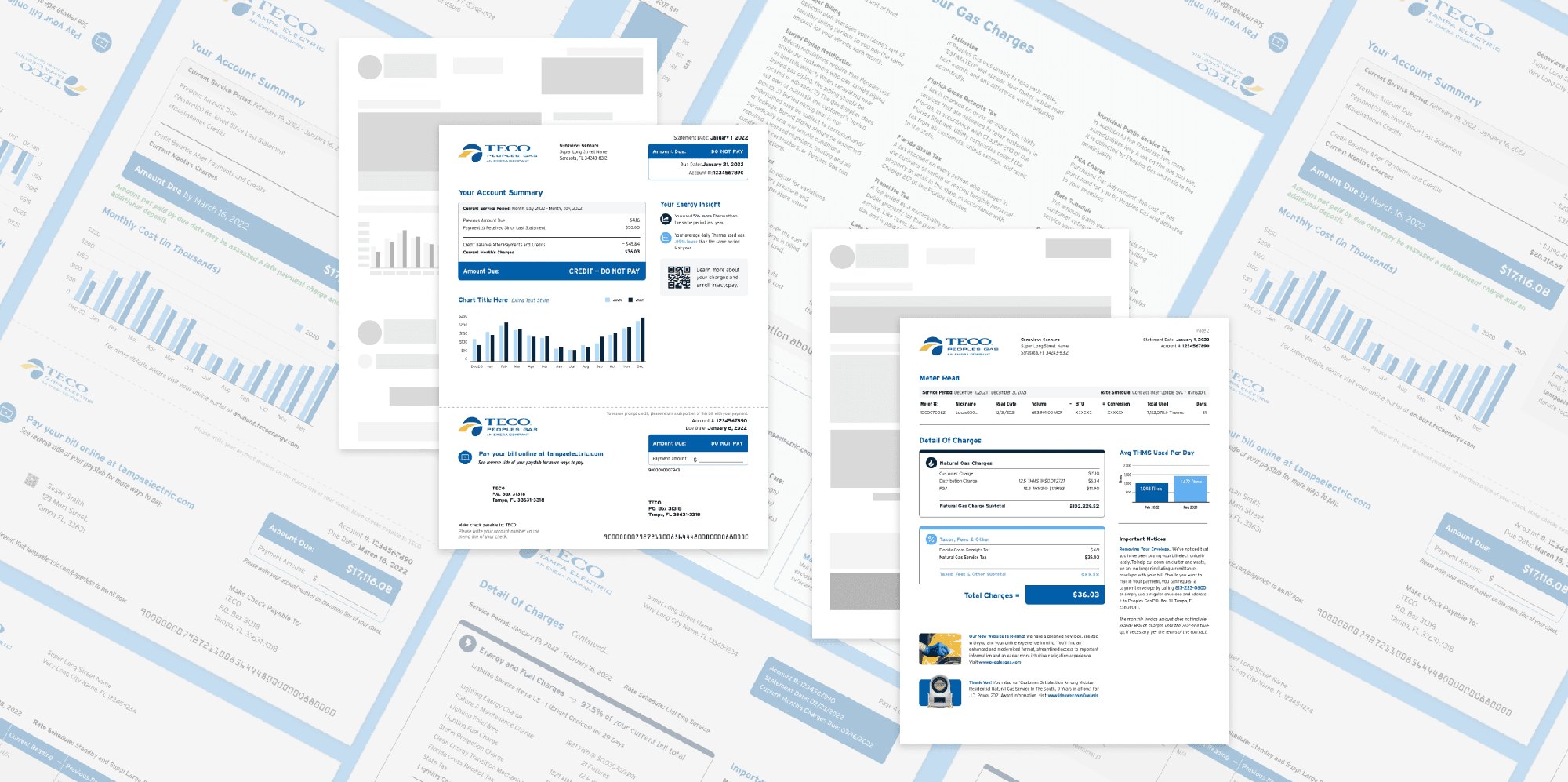
Confusing layouts and inconsistent formats on TECO's paper bills were driving a surge in customer service calls.
Led a full redesign of the bill grounded in research, stakeholder alignment, and a workshop where customers built their own ideal bill.
A modular, consistent bill system across residential and commercial, gas and electric. 72% better comprehension and 40% fewer billing calls.
A bill people need, but can't read
TECO customers faced ongoing challenges understanding their statements because of unclear layouts, inconsistent formatting, and overwhelming information. That led to confusion around payment details and energy usage, and a steady rise in customer service inquiries.
Despite how essential a utility bill is, there was a real lack of user-friendly communication, and customer feedback wasn't part of the design process. That created a gap between what customers needed and what the bill was actually showing them.
…give 800,000+ customers a bill they can understand at a glance, so they don't have to call to figure out what they owe or why it changed?
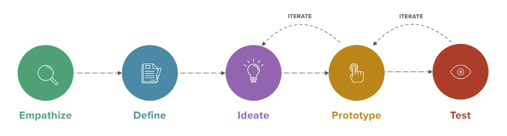
Benchmarking the industry, then listening
I started with an in-depth industry analysis of how leading utility providers design and structure their statements. That surfaced common best practices: clear payment summaries, visual usage breakdowns, and standardized layouts that make bills easy to read.
Comparing those benchmarks to TECO's existing bills made the gaps in clarity, consistency, and experience obvious, and gave the redesign a strong foundation.
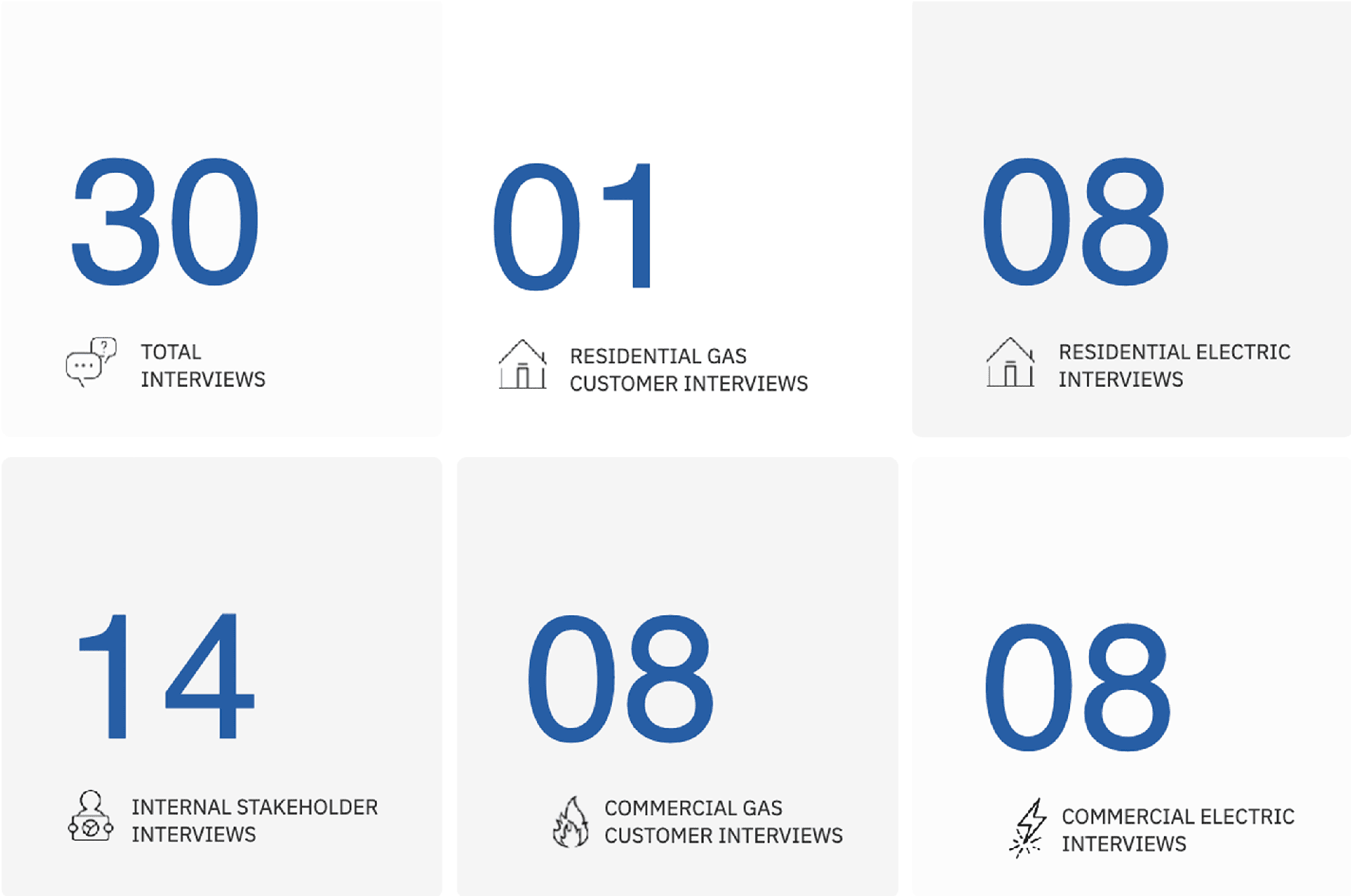
30 interviews across every side of the bill
We interviewed residential and commercial customers as well as internal stakeholders. That mix gave us everyday bill recipients alongside the people who manage and deliver the billing process, and it's where the pain points, priorities, and opportunities for the redesign came from.
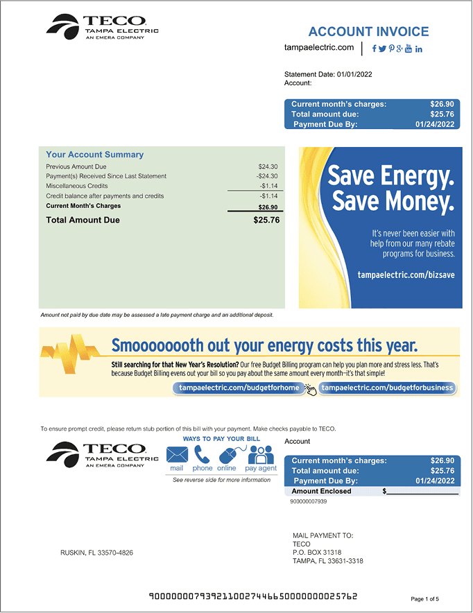
Page by page, where the bill breaks down
Before designing anything, I went through the existing bill one page at a time to pin down exactly where customers were getting lost.
Breaking through the noise
- Social media links and marketing messages compete with critical account information
- Redundant payment information appears twice, creating confusion and visual clutter
- Essential account details get lost among promotional content
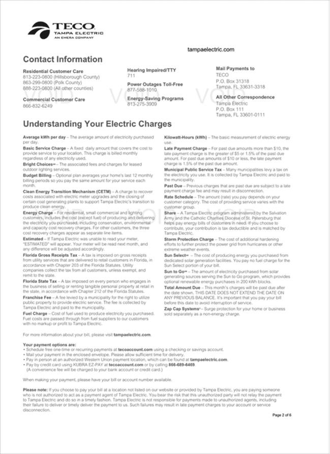
Information overload
- A wall of text makes important charge definitions hard to scan and understand
- Contact information lacks visual hierarchy and clear organization
- Critical information is buried inside long paragraphs
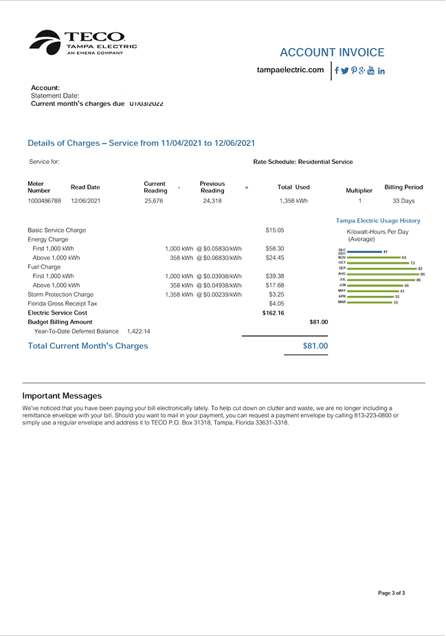
Data clarity
- Complex billing calculations have no visual guidance to help explain charges
- The usage history graph is undersized and underused for showing consumption patterns
- Key metrics get lost in dense numbers
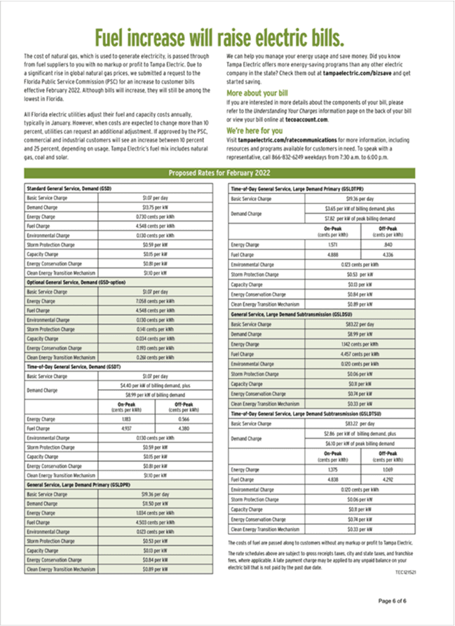
Rate complexity
- Dense, technical rate information with no visual aids or clear categories
- Multiple rate schedules with no clear navigation or user context
- Technical detail overwhelms anything practical
Breaking down the current bill
Analyzing the original bills surfaced clear patterns, which became six core component categories. These mapped the current state of the bill and set up everything that came after.

- Critical transaction elements
- Account authentication details
- Payment method options

- Charge breakdowns
- Rate applications
- Visual cost representations

- Contact and understanding documentation
- Educational materials
- Reference guides

- Residential templates
- Commercial layouts
- Service-specific variations

- Usage overview
- Historical data
- Promotional integrations

- Budget billing options
- Solar program details
- Program enrollment information
What we heard, and the rules it gave us
We synthesized insights from customers and internal stakeholders across residential, commercial, and operational perspectives. Affinity mapping the feedback surfaced recurring themes and clarified the core problems the redesign had to solve. That became the foundation for every design decision after it.

Customers want to easily identify and understand the information on their bill statements.
“Only a portion of the information I care about most is on the front page.”

Customers want to be fully aware of what's on their energy statements, and they look to TECO to communicate that information.
“I want to know what I currently don't.”

Customers won't engage with their statements because of a lack of knowledge, unless there's a noticeable inconsistency.
“I do not understand my service charges and I request support when fluctuations are significant.”

Customers are open to changing how they use energy when the bill gives them clear, trustworthy information to act on.
“I would be willing to change my behavior if I was confident that I was making the correct decision.”
Six tests every component had to pass
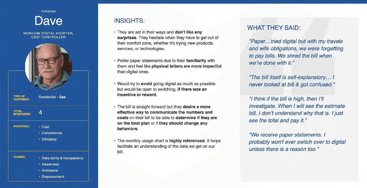
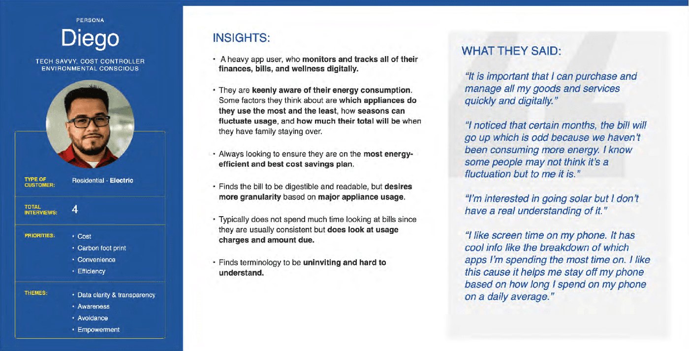
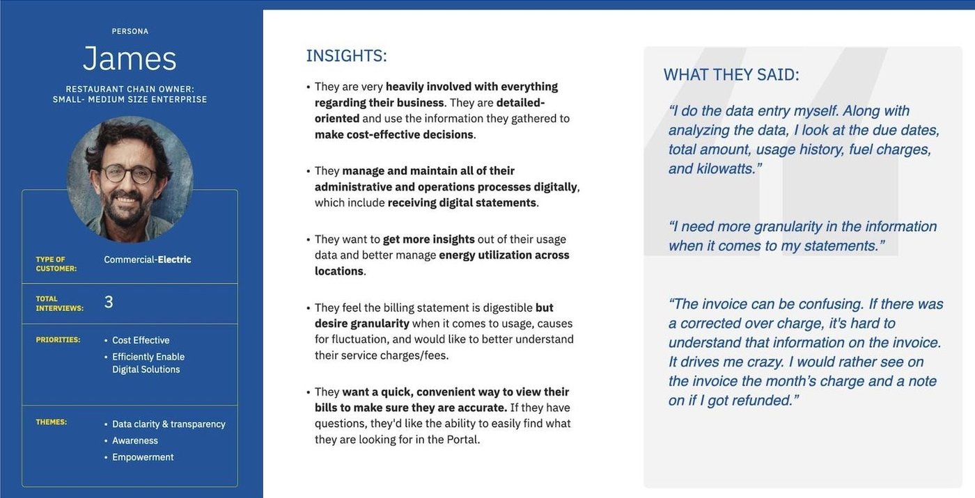
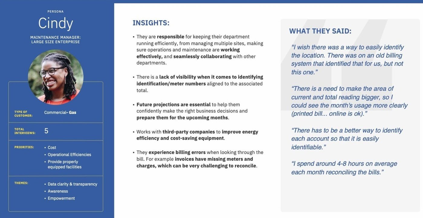
Four customers, four very different bills
We turned the research into personas for the key residential and commercial segments. Each one captured different goals, pain points, and habits, and grounding decisions in them kept the redesign tied to real people.
Customers built their own bill
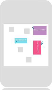
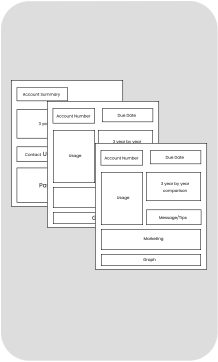
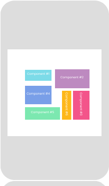
I turned the insights into a library of modular bill components, from payment summaries to usage visualizations, designed to be flexible, consistent, and easy to use.
To test and refine them, we ran a co-creation Enterprise Design Thinking workshop with customers, who assembled their ideal bill layouts in real time. It showed us directly what worked, what confused people, and how the pieces fit together.

The building blocks customers worked with
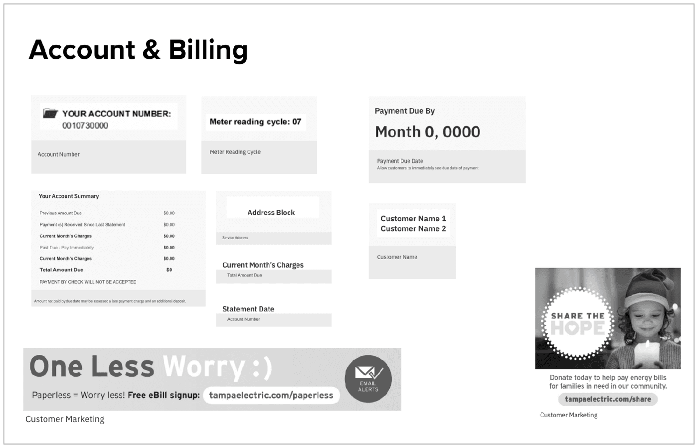
One system, four bill types
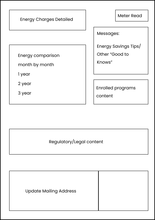
Each workshop group built a bill for their segment. These are the layouts they landed on and the reasoning behind them. They became the blueprint for the final design.
Residential electric
Residential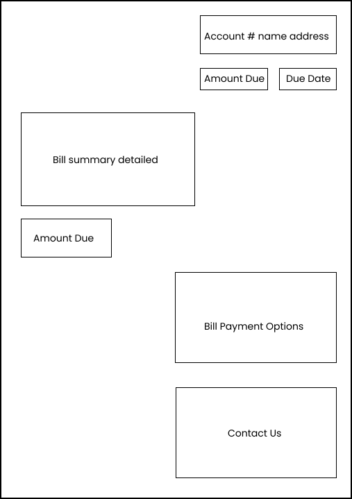
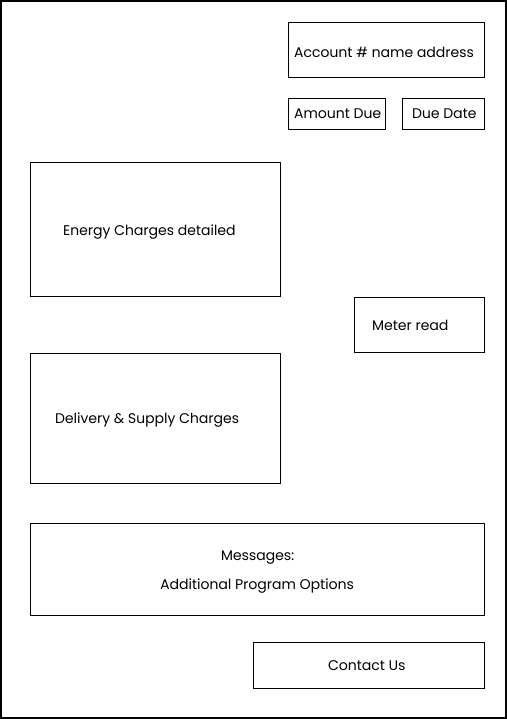
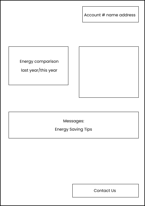
Residential gas
Residential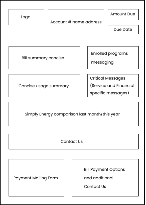
blank
Commercial electric
Commercial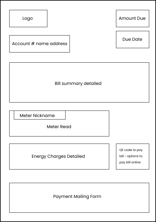
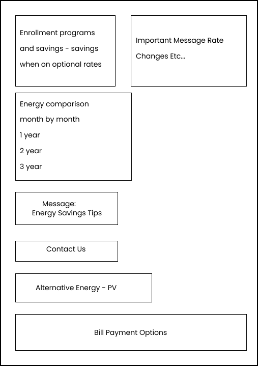
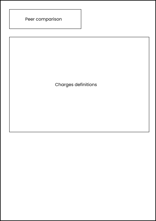
Commercial gas
Commercial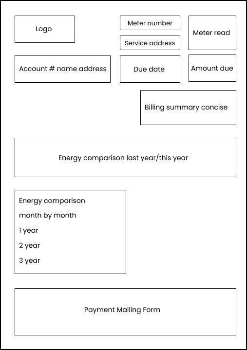
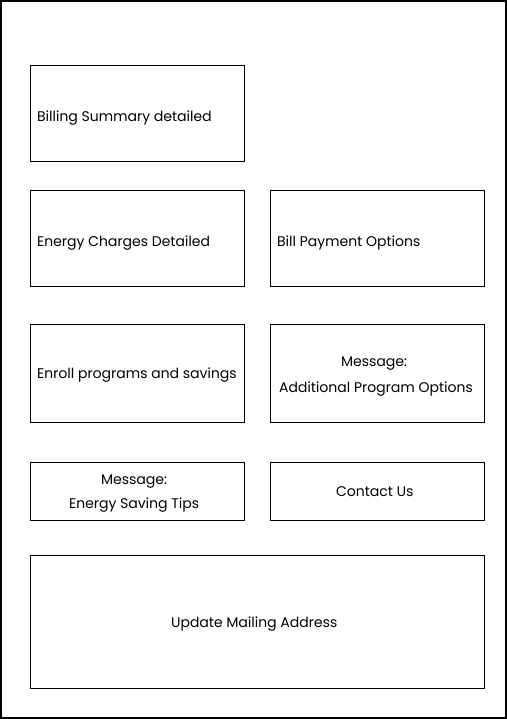
blank
From workshop wireframes to a finished bill
We built high-fidelity prototypes of the future-state bill, updating existing components and adding new ones based on everything we'd learned. Feedback from the co-creation workshop shaped multiple rounds of iteration and testing, until the design was clear, consistent, and ready to implement.
Front of the bill
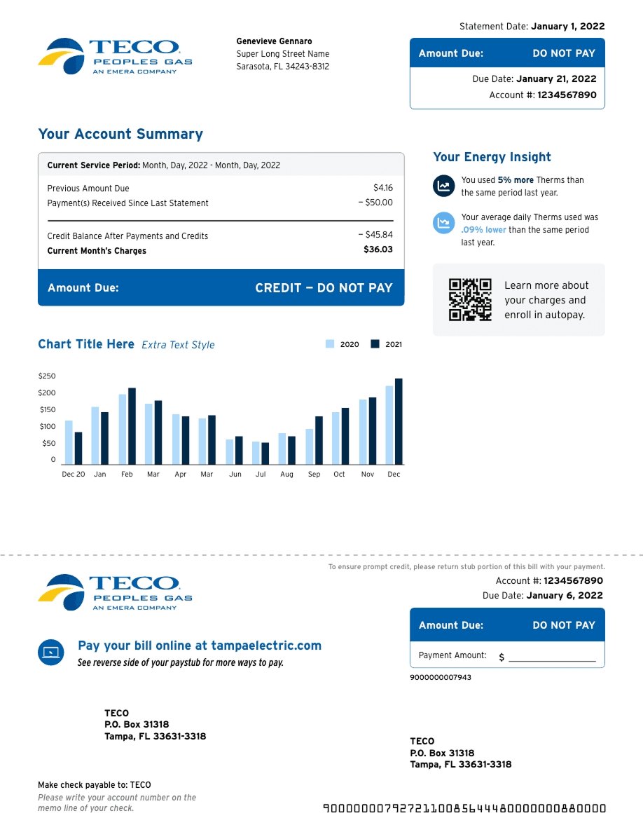
Drag the handle to compare. Amount due, due date, and account details now lead the page. The usage chart is bigger and easier to read, and the marketing that used to compete with account info is gone.

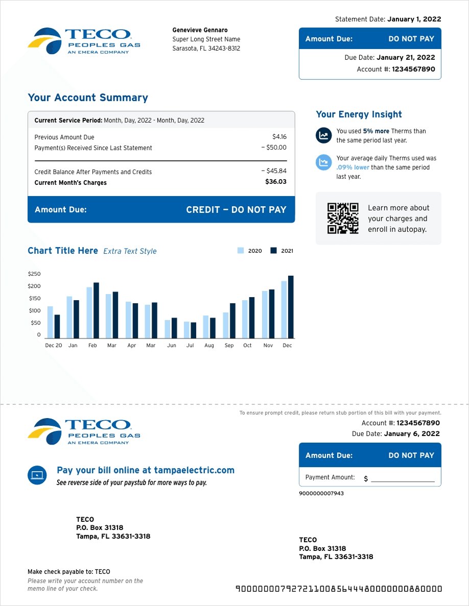 WireframeFinal
The new paper bill
Clearer bills, fewer calls
The redesign gave customers a bill they could actually follow, and gave TECO a consistent system across every customer type.